

The bedroom paint colors I keep coming back to all have one thing in common: they’re soft, a little muted, and warmer than you’d expect. Sage and gray-greens, clay and dusty rose, warm whites, and the occasional deep, dark wall. Below is how each family behaves on a wall, what’s trending right now, and whether a dark color really shrinks a small room.
Sample squares are worth the trouble. The same green looks fresh next to a south window and almost gray in a north-facing room, so tape a few swatches up and look at them in the morning and at night before you buy a gallon.
The finish matters almost as much as the color. Matte and eggshell hide small wall flaws and look soft in lamp light, which suits a bedroom. Satin is easier to wipe clean, so it’s worth considering if kids or pets share the room. Limewash and other mineral paints add a cloudy, uneven texture that makes even a simple color look rich.
Why the right bedroom paint color changes everything
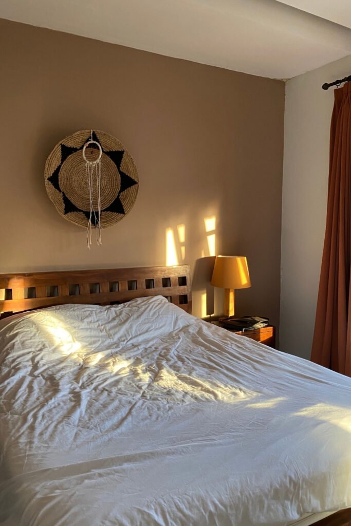
Photo by Наталья Маркина on Pexels
Your bedroom walls are the first thing you see in the morning and the last thing at night. Many designers recommend muted, desaturated colors for this room: Muted, desaturated versions of green, blue, and soft warm neutrals consistently perform best for sleep quality, while bright, saturated shades feel energizing, which suits a kitchen better than a room where you’re trying to wind down.
That’s why so many bedrooms end up plain white. White feels safe, but stark white can look clinical and doesn’t make the room feel like a retreat. A warm white with a hint of cream, in a room with good daylight, already feels softer. Designers in 2026 are moving toward cocooning, biologically calming tones: muted greens, dusty blues, warm taupes and clay. Colors with depth, but without intensity.
How light changes the color on your wall
A paint chip under store lighting tells you very little. Daylight from a north-facing window is cool and soft, so it pulls colors toward gray and blue. A south-facing room gets warm, strong light most of the day, which brightens everything and can make warm colors look almost orange by late afternoon. East-facing rooms are bright and warm in the morning and flat in the evening, west-facing rooms the other way around.
That’s why undertone matters more than the name on the can. In a north-facing bedroom, a green or beige with a warm, yellowish undertone keeps the room from looking dull. In a sunny south-facing room, a slightly cooler gray-green or a muted blue balances the warmth.
Lamps change the picture again. Warm white bulbs (around 2700K) make greens and clays look softer at night, while cool bulbs can make the same wall look flat and gray. Check your samples under the bulbs you actually use, not only in daylight.
A practical routine: paint two or three large sample boards, at least 12 × 12 inches, and move them around the room for a few days. Look at them next to the window, behind the bed and in a dark corner. The color you still like in every spot is the one to buy.
What bedroom paint colors are trending right now?
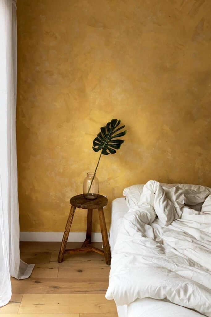
Anything grounded, warm and natural. Dusty botanical greens and soft warm neutrals are leading the way this year, and the sage and gray-green family is everywhere. They work with wood, linen and most decor styles, which is a big part of why.
Beyond green, designers are also leaning into clay tones, deep plum, and warm brown, moving away from the cool grays and bright whites of the last decade. Warm tones like beige, blush, tan, and cream create feelings of coziness and comfort, and warm ochre or limewashed walls add texture on top of color, so even a plain wall looks layered.
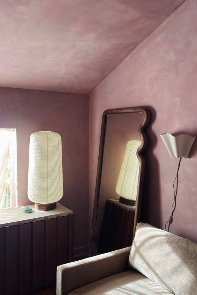
Soft lavender and plum sit at the cooler edge of this trend. Paired with white furniture and a warm lamp, they read calm rather than girly.
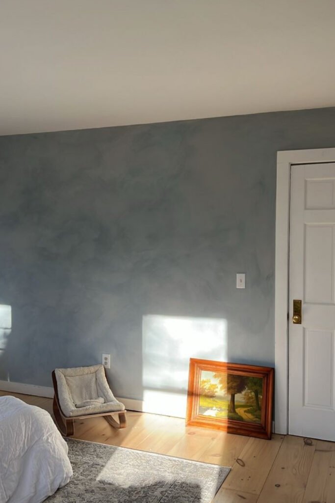
Dusty blue does the same for people who love blue but find it cold. A gray-blue with a bit of warmth in it looks very different from icy blue, which, along with stark white and anything clinical, is slowly losing ground.
The colors I keep coming back to
Two color families keep winning: they work in small and large rooms, with different furniture styles, and in most light.
Soft sage and earthy greens
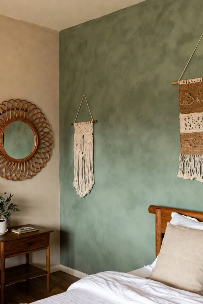
Green earns the attention. Soft greens bring a sense of calm, wellness, and restorative energy, and a muted sage with white trim, wood furniture and linen bedding looks fresh without feeling cold. Woven textures like rattan or macrame suit it especially well.
Earthy greens like Clare’s “Daily Greens” work if you want something deeper without going dark. Nervous about committing? Paint only the wall behind the bed first. More often than not, you’ll want to do the rest of the room afterward.
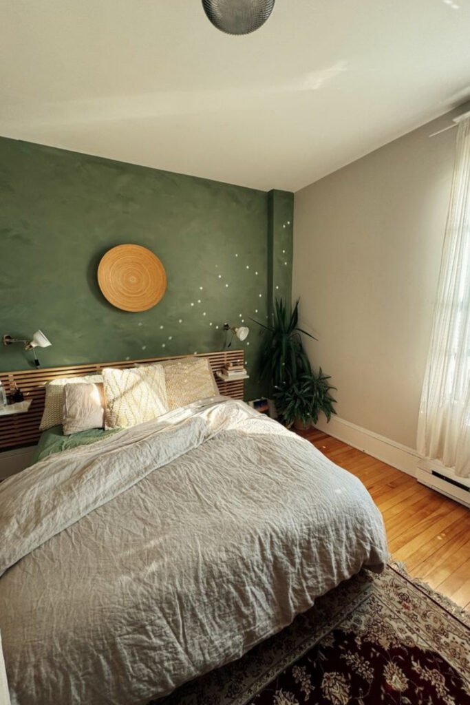
A slightly darker green pairs nicely with warm wood and a round mirror, which bounces light back into the room.
Warm neutrals, clay, and dusty rose
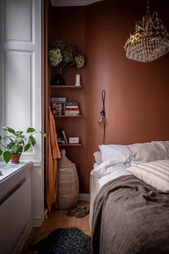
If green feels too colorful, look at warm neutrals. Not the flat builder-grade tans of the past, but colors with undertone: warm whites with a hint of cream, sandy taupes that move between gray and brown through the day, and rich clay tones that make a bedroom feel layered, calm, and comfortably lived-in.
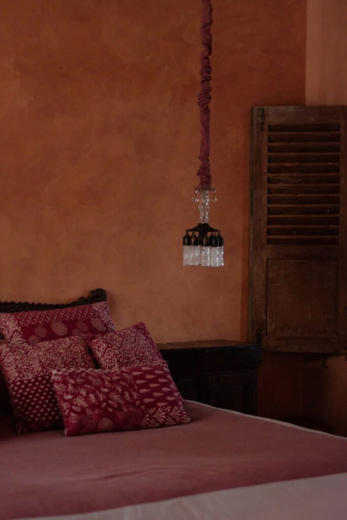
Photo by Ksu&Eli Studio on Pexels
Terracotta is the bolder sibling of clay. With red or rust textiles and a warm hanging light, it makes a bedroom feel enclosed and calm rather than loud.
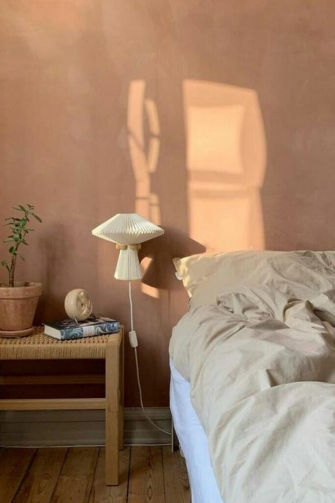
Dusty rose is the other one I can’t stop thinking about. It’s warm and soft without looking childish. A barely-there blush pink feels like golden hour on your walls, and it goes well with deep wood tones and brass. It also doesn’t have to be the expensive designer shade: plenty of affordable lines have a good muted pink.
Do dark bedroom paint colors actually make a room feel smaller?
It depends on the room and on how you use the color.
The old rule says light colors make a room look bigger and dark colors make it look smaller. There’s some truth to that in rooms with very little daylight. But designers have been pushing back on this for years, and dark colors can make a small room feel more spacious when they’re used well. Dark walls blur the corners, so you can’t see exactly where one wall ends and the next begins.
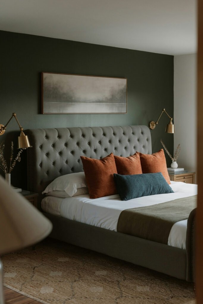
Photo by Clay Banks on Unsplash
Painting the ceiling the same dark color as the walls amplifies this effect, because it removes the line between surfaces, and the room reads as one continuous shell. Deep navy, charcoal or forest green can make a small bedroom feel like a hotel room instead of a closet.
Balance is what makes it work. With dark walls, keep the bedding lighter, use warm lamps, and add a mirror or a metallic accent to bounce light around. Let the walls be the backdrop and everything in front of them stand out.
Muted beats bright in a bedroom, warm undertones beat cold ones, and a dark color can work in a small room if the bedding and lighting stay light. Tape up a few samples, live with them for a few days, and pick the one you keep looking at.




Leave a Reply